The Stanley Cup in Ithaca

The Stanley Cup page makes me feel a bit old.  I had just finished playing in Cornell’s after-work golf league when I discovered that the Stanley Cup was on view in the clubhouse.  All of the invited guests had been given a chance to see/hold it, and I was able to walk right up and pick it up.

I was lucky enough to have a friend in attendance who offered to take this picture with a film camera, and she later sent me a print, which I scanned.  In those days, there weren’t dozens or hundreds of smart phone cameras at every gathering, so I feel very fortunate to have a record of the event.  I also doubt that most fans get to lift the cup by themselves at modern events like this.

For years I used this picture as the head shot on my web page and LinkedIn.  But I can’t say I look like this anymore.  The beard is gray and I’ve probably filled out a bit.  So, I had my wife take a new picture for the head shot.  At least I still have a good reason to keep this one on my web site!

The “About Me” Page

My About Me page used to contain some pictures of my family and the kind of personal information that seemed more appropriate when the internet was younger.  I have turned it into a summary of my career, including links to my LinkedIn page and current resume and some short summaries of my work experiences and education.

I wanted the page to look more like a professional web site than most of the other content I had reworked before.  I created four sections of exactly the same size and added drop shadows below them.  Two of the sections use JavaScript to show a paragraph of information when the user hovers over one of the contained images.  This dynamic display is a bit different than the one in the Broken Leg page.  There, an image was overlaid at a fixed position that was calculated dynamically.  Here, a div is dynamically inserted at a relative location by manipulating the DOM.

I am pretty happy with the way it looks and works.  A message is shown in JavaScript is disabled, though that may be a poor alternative to seeing the dynamic text.  Part way through the work I realized that this design is not compatible with touch screens, where there is no ability to hover.  I will need to revisit this issue and see if there is a way to maintain the dynamic display without changing the feel of the page.

A Centralized CSS File

After reworking three web pages, I am seeing certain CSS content that is the same across all pages.  I have moved this into a central CSS file that is now included in all site pages.  Each page also includes a local CSS file with stylization that is specific to that page.  The central page now includes a background image and a font specification.

Changing the font really helps make the page look less like a relic from the 1990s.  After doing some reading, I decided to use Google Web Fonts rather than including font data files on my site.  I am not that particular and think the Merriweather font looks fine, so I chose that.  Not having to maintain the font data is very appealing to me, and the load time still seems reasonable.

My First JavaScript

While modernizing the My Broken Leg page I decided it would be nice to show the large version of the page’s images when users hover over the thumbnails, rather than requiring them to click the thumbnails and be taken to another page. Of course, doing this required my first foray into using JavaScript within a web page.  I believe it’s best to learn new languages and tools while trying to accomplish something specific, so this was actually a great opportunity.  Not only did I learn a lot about some specific aspects of JavaScript, but I got a good feel for using it in general.

The functionality is written so that a web page uses a single function to create the “active” thumbnail, passing a unique root name of an image and an alternative text string.  The function adds a named thumbnail to the page and listens for the appropriate events in order to show and hide the large image as needed.  Obviously, the thumbnails and large images need to use the same root file names and be stored in known locations, so the solution isn’t completely generalized.

A more challenging aspect of the project was getting the images to show up in desirable locations.  For instance, if the thumbnail appears in the upper left part of the window and there is room to show the full image at the same position, then that is the most desirable location.  If the thumbnail is at the right or bottom of the window, then aligning the large image with other edges of the thumbnail would be better.  Making these decisions requires knowing the size of the image before it is shown.

A web search turned up many questions about the best way to find an unloaded image’s size and the answers suggested a number of different approaches.  I did not have success listening to the image’s “loaded” event, as the image size was usually not updated by the time the event was fired.  Instead, I went with the approach of polling the image size during loading to see when it had changed (this happens only at the end of the load).  This eventually required creating a new image object each time an large picture was to be shown, rather than changing the source of an existing image object.  Using new images made it easy to see when the size changed from zero to non-zero.

Another interesting problem turned up when I decided to let users dismiss the large images not only by moving the cursor out of them but by clicking the mouse.  If the cursor was still over the thumbnail, the large image would be shown again immediately!  Solving this required keeping a list of all active thumbnail images and checking the mouse position vs all of their bounds whenever a large image is dismissed with a click.  If the mouse is over a thumbnail at that time, a different state is entered that disallows showing a large image until the mouse leaves the thumbnail.

I’m pretty happy with the results.  They seem fast on my PC, but I will have to check out the behavior on a touch screen device.  The ability to click a thumbnail to see the large image was left intact, so that might still work on touchscreens.  I will probably use a technique similar to this on some other pages in order to show the description of a page when the user hovers over a link to it.
Updating My Broken Leg

The My Broken Leg page was one of the more visited parts of my site back in the day.  I often received emails from people who had recently broken their leg and were looking for information about what lay ahead for them. At the time, there weren’t very many medical resources available online, but things are much better now.  I rarely get emails about my broken leg anymore, but still want to share whatever information I can.

I performed the standard cleanup to this page – splitting style out into a CSS file, removing broken links, adding a bit of new information.  I also noticed that both the thumbnails and linked images on this page were relics of a time when screens were smaller and downloads were slower. I made the thumbnails larger so they show up better, but the source images (scanned from photos and X-rays) are still a bit smaller than I’d like.  In a future change I hope to show these larger images as overlays when the user hovers over a thumbnail.

This is the first time I used floats to place images on one or both sides of a block of text.  I ran into a bit of a problem with text that extended below the images, as it started filling in the area below the images.  This was particularly bad for the list text.  I found that using overflow: hidden was the right way to prevent this, though the name of that command suggests it would do something different (like hide the overflow!).

Updating “Spring Into Action”

spring

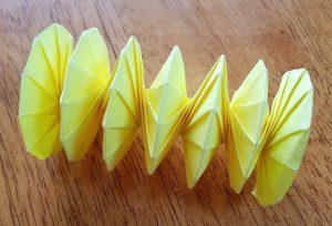
I created the original version of the Spring Into Action page after the SIGGRAPH (computer graphics) conference in New Orleans in 1996.  A copy of that page is still available at an FTP site at Silicon Graphics (SGI) – isn’t that ridiculous?  Since then, a number of people have uploaded YouTube videos showing how to fold this origami model.  While seeing it done is probably better than reading a lot of words, I think there is still value to this page, as many videos are done without voice and with few written instructions.

I updated the text a bit, added a short video showing the spring in action, and updated the old HTML into separate HTML5 and CSS files.  Nothing fancy, but this is my first use of an embedded video and my first time limiting the width of the content regardless of the window size.

HTML5

I guess I got ahead of myself when turning in the new version of the Ithaca Weather page.  After doing so, I read some more about HTML5 and realized that instead of using <div> with class names assigned for header, section and footer, I could actually use elements of those types.  So something like:

<div class="section">
<h2>Ithaca Historical Weather</h2>
<p><a href="http://www.usclimatedata.com">U.S. Climate Data</a></p>
</div>

and

.section h2 {
margin: 1em 0 0 0;
}

.section p {
font-size: 1.3em;
margin: 0 0 0.2em 0;
}

becomes

<section>
<h2>Ithaca Historical Weather</h2>
<p><a href="http://www.usclimatedata.com">U.S. Climate Data</a></p>
</section>

and

section h2 {
margin: 1em 0 0 0;
}

section p {
font-size: 1.3em;
margin: 0 0 0.2em 0;
}

I like this a lot better and it seems like the right thing to do, so I’ll be using this as much as possible in future changes.  After reading about the other changes in HTML5 and am looking forward trying to use the canvas and drawing SVG graphics on some new experimental pages.

I also ran the page through web-based lint programs, using Another HTML Lint and CSS Lint to clean up a few things.  I may run lint regularly, but might not have the energy or humility to make all of the petty changes it suggests.

Updating the Weather Page

wbt_in_snow

The Ithaca Weather page is the first one I chose to modernize from its antiquated 1990s format.  It is one of the least viewed pages on the site and half the links were broken, so little harm could be done if it went wrong.  After separating all the styling out into its own CSS file, I tweaked a few things.

The image at the top now has rounded corners.  The link to my main page has been moved into a “footer” div that is in a fixed location against the bottom of the screen.  This required lengthening the page content so that none of it is hidden behind the footer when the window is not tall enough. Also, an “About this page” link has been added to the footer that will show all blog posts that include the “Weather” tag.  I hope to use footers like this on all the pages that I update.

I developed the page on Chrome, then tested in on Firefox and Microsoft Edge.  Are developers still obligated to test it on Internet Explorer?  I am not going to try Opera and Safari as their usage is too low.  I looked at it on my Android phone and all was well, though that may just have been lucky due to the narrow content.  I’ll study that problem more when I update some of the other pages.

I would like to come back to this page sometime and make it show something interesting based on calls to a weather API.

Getting Started

Way back in 1995, I coded up my personal web site for the first time. Things were very static back then, just HTML and a few server-side scripts (written in CSH on Unix, if you can believe it!).  For a few years, I maintained the pages, fixing dead links and adding new content.  But as other life activities took more of my time, I stopped working on it and it is now sort of a time capsule from 2002.

The twenty year old site now looks desperately out of date, and I don’t yet have the skills to bring it up to speed.  But I can learn new things, and there is plenty of information available on modern web development tools and techniques.  So, I am going to learn about these tools while renovating the site.  I’ll begin by cleaning up the existing pages to use HTML5 and CSS3.  After that, it will be time to add some JavaScript and use other more recent techniques.

To start, I have used WordPress to build this blog and I created a local Git repository to store the change history of my web site source.  I plan to publish short blog entries after each little project and use keywords that will link each site page to the relevant blog entries.  Now to get to work!